
Role: Researcher, UI designer, Brand designer
Time Frame: 2 weeks
Project Type: UX/UI Design
Project Prompt: Design a testimonial submission flow for a rustic wedding venue
Tools Used: Adobe XD, FigJam, Typeform Surveys.
Discover
Before creating any wireframes or lo-fi prototypes I wanted to get some intel on how users interact with testimonials, and who these users are.... besides the bride and groom.
Research Candidates:
-
brides/grooms
-
wedding planners
-
venue owners/ vendors
Research goals:
-
Learn what platforms users are currently using to submit review's
-
Learn about how venues/ owners feel about reviews/ testimonials
-
Learn what type of information is most helpful for those reading reviews, and which sites they go to to read reviews

Synthesized Research Insights:
-
77% of participants said they will always look at the reviews when making a decision
-
66% of participants said they are highly likely to leave a review for a venue
-
most common websites are wedding wire and google because they lack bias and are consistent across all venues
-
Most commonly users are looking for topics in reviews such as: things that went right and went wrong and how they adapted to problems, how organized they were and how their communication skills were.
-
Users often said they would scan for specific reviews with 4 star ratings
-
Venue owners/ vendors said they had a hard time getting their clients to leave a review at all, and when they did it often lacked depth or detail
Define
Based on the findings from my preliminary research shown above, I was able to create criteria necessary for a successful testimonial flow.
1. Reviews left by customers should be helpful for potential customers, this can be addressed by the following:
-
asking users to address the most commonly searched for topics, through ratings (this will prompt the user, and also make it easy)
-
include data such as season the wedding took place, the guests status (ie, bride/groom, guest, planner)
-
other relevant information such as number of guests and/or packages used
2. Include the venue owner as a user in this flow by:
-
allowing him to send an email/SMS invite to leave a testimonial
-
making sure the page a user lands on after clicking the link in the invite will be easy to navigate and make sense to the user.
-
prompting the user to easily include specific criteria in their testimonial, giving the venue detailed and valuable feedback.
Develop
Now it was time for me to develop some lo-fi wireframes, before the first usability test.
Wire-Frames


Lo-Fi Wireframes


Test #1
Now it was time to test my lo-fi wire-frame. The goal here would be to ask users to submit a testimonial. They would find themselves on the home page and then find a way to direct themselves to the testimonial submission page.
KPI's:
-
time spent on task
-
time spent looking for submission form
-
comprehension of content
What they said:


What they did:


Actionable Insights
-
Finding the testimonial submission form wasn't immediately easy
-
make the page the user is on obvious and clear
-
make the button to submit a testimonial stand out more
-
integrate rules of UI and visual hierarchy better
-
-
Progress bar was in an awkward location where users eyes didnt naturally travel to, so it went unseen
-
position progress bar into a more likely area
-
-
perhaps the featured testimonials aren't needed on the testimonial page as they are already previewed on the home page. Removing this section would reduce clutter on the page and allow the user to complete their intended task quicker and with less distractions.
Develop
Based on the Insights from my recent usability test I was able to make changes to the lo-fi wireframes and then start adapting it into a high-fi prototype by introducing photos, branding, text and interactions
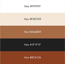
Some light branding to fit into the "Rustic" theme. I went with neutral tones and classic/ elegant typefaces. I want the website to look sleek, and modern with hints of old time rustic design elements.


Test #2
With my Hi-Fi prototype ready to go, I was ready to start the final round of testing (I think). The goal remains the same, have the user go through the testimonial submission flow.
KPI's
-
Time spent on task
-
Comprehension
What they Said:


What they Did


Actionable Insights based on Feedback from test #2
-
add a progress bar to mobile version as well
-
asking for email deters the user from continuing with the form, so I should either exclude it, allow for a skip option or state why the email is being asked for
-
the second page of the testimonial submission flow is slightly overwhelming, so I need to reduce the amount of text and questions asked on that page
-
user pressed on the "Old Mill" logo to be directed back to the home page, but it didnt work, meaning that I should link the logo to the home page as this is a common assumption
Develop
Now it is finally time for me to make the final changes to the web and mobile interface. Below you will see the changes I made to the web and mobile interface based on research
Addition of Progress Bar Before and After


Decreasing Verbal Clutter Before and After


Considering the often-forgotten user.
One of the main pain points uncovered during my research was from the perspective of the venue owner and staff. They mentioned that past clients hardly ever leave reviews.
My solution was to use effective copy within an e-mail link to the review page.


Additional UI Changes Before and After (example)

Final Result

Responsive Web Design and Submission Flow
Old Mill Wedding Venue | Toronto